Evolution of a Book Cover
When designing the cover for my own novel, Waves, I tried a number of approaches before settling on a design that worked for me. This article details my process.
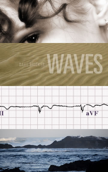
Before I even finished writing, I played around with an idea, initially planning to release a 5×8 inch paperback.
I liked the juxtaposition of themes from the story; physical waves, waves of life, the waves in the girl’s hair, but it’s too busy. It’s also a bit drab; too balanced and static. I just never fell in love with it. Also, the contemporary approach to book cover design so often starts with a photo search. It often works, but it’s predictable. Maybe a good designer should go beyond finding photos that “go with the story?” At least some of the time?
My next attempt looked something like this:
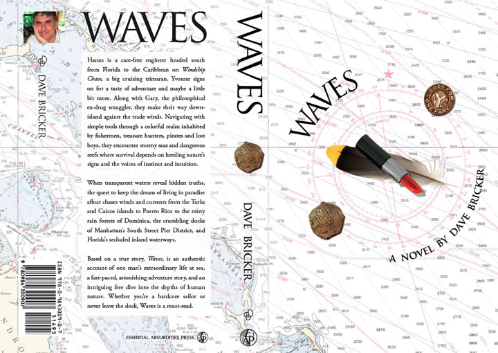
The story is about an ocean voyage in the Caribbean, and this design has the nautical theme going for it. The feather represents freedom and the lipstick holding it down represents forces in the plot that inhibit that freedom. Like a compass needle, the lipstick points southeast down through the Caribbean. The two coins on the compass rose represent modern and traditional temptations—things that can pull you off course. Also, in the initial draft, the characters wind up in New York City. That 600-page draft got cut into two books and the New York portion now happens in the second book (entitled Currents). That certainly eroded the relevancy of the subway token.
I stuck with this design for a long time because there’s a compelling story about how it relates to the plot of the book. It makes a good intellectual argument for itself. I tried many substitutes for the subway token, but there’s too much going on; there are too many references to themes the viewer hasn’t read yet. It’s a big heap of confusing metaphors, not altogether bad as a visual composition, but too much like a joke that requires an explanation of its punch line. There’s a lot going on. The average reader will probably not make all those conceptual connections.
Two things happened next that changed my direction.
The first was my reintroduction to great modernist book covers by the likes of Paul Rand and Alvin Lustig.

Cover by Paul Rand
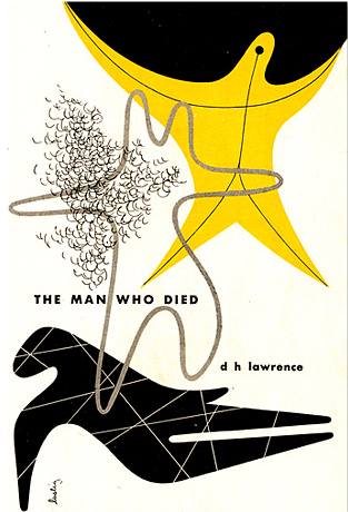
The Man Who Died – Cover by Alvin Lustig
These covers have a delightful, powerful, artistic simplicity that captivated me. As a design teacher, I’d been exposed to this work before, but initially, I was thinking commercially; about packaging a book as a product. While I’ve always shied away from the “Photoshop filter festival” that characterizes much of contemporary design, I was visualizing the new cover within the context of “what books look like today.” In researching book design, I came across a copy of By Its Cover, about Modernist book design, and knew it was time to change directions.
I played with some digital brush strokes from an old mac beta copy of a long-dead program called Expressions. (It went through several owners before Microsoft bought it, rolled into Silverlight and discontinued the mac version altogether). I wanted an organic, personal quality to the final design, and this application gave me brush strokes that looked watery and hand-rendered, even though they could be scaled to any size. I wanted a simple graphic to convey the feel of a powerful wave. I chose a Bodoni variation for the typeface on the cover because the fine serifs reminded me of the spreaders (crosspieces) on a sailboat’s masts. Finally, I added a subtle paper texture to warm things up and move past the stark white of glossy, unprinted paper.
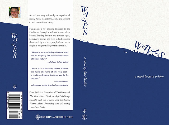
At this point, I sent out for a proof copy and received what will likely be the one, single paperback copy of Waves that will ever get printed.
The second thing that happened was the Miami Book Fair. There, on table after table after table, I saw thousands and thousands of paperback books; a phenomenon I referred to as “an explosion in a confetti factory” in a previous post. It inspired me to rethink the role of a book’s cover, and catalyzed my return to the Modernist approach. I couldn’t stand all the “junk” on the back of my paperback cover; all that text ruined the flow of the design. Books didn’t always look like advertisements; that’s a contemporary trend.
The prevailing mythology suggests that when your book is sitting in a bookstore with thousands of others, the cover has to be visually strong enough to compel the reader to pick it up and investigate it. However, unless your book has a remarkable spine, it probably won’t stand out very well when it’s stuffed onto a bookshelf. Moreover, if it’s an independently-published book, the chances of it being sold in a bookstore at all are pretty slim. And let’s face it, could there be a worse place to sell a book than through a retail outlet that takes 50% of the gross for placing your book in a huge stack of works by competing authors? The majority of my book sales have always been direct. I’m just not buying the notion that a book cover is a competitive advertisement, especially for a fiction book.
I made some business and design decisions. I went to a 6×9 inch cloth-bound hardcover format with a foil-stamped spine; the best quality available through print-on-demand (POD). Paperbacks have an important place, but they’re retail products; a commodity. As a fiction writer, I don’t expect to get anywhere near the bestseller list. My writing is fundamentally an artistic effort and I saw no reason to dilute that effort with cheap packaging. When it comes right down to it, books aren’t really my product, anyway; book design is my product. Why produce an inferior representation of that offering? I moved all the annoying advertising copy off the back and placed it on the inside jacket flaps. Ah…negative space. How nice to unclutter the design. I did some typographic research, looked through some old books produced during the early twentieth century and made every effort to match the quality of the typesetting with a mixture of contemporary and classic typefaces.
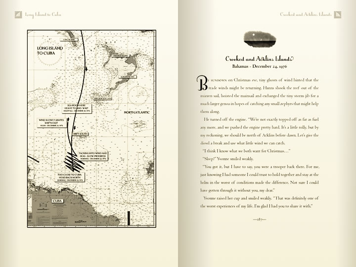 What I ended up with, between the old school typesetting and the cloth-bound cover was something no traditional publisher would likely invest the time or money to produce. The blue wave on the cover wraps uninterrupted around the spine to the back. Rather than create a composition full of visual metaphors, I tried to create a feel for the story with simple shapes and colors. This is the version that went to print.
Waves, along with the newly redesigned version of The Dance, stands as my personal challenge to anyone who believes self-published books are universally lacking in quality. As with any aesthetic form, any number of opinions might justifiably be tendered in support or opposition to my approach and the philosophy behind it, but I’m as pleased as I could be with the final book without having spent big money on offset printing or metallic inks or embossing. Moreover, I’m seeing POD publishing not as a “poor man’s alternative,” but as a way to affordably produce high-end books that approach the design craft of the early twentieth century.
Certainly, this style doesn’t fit every book and every story, but I continued the tradition with Currents, my third novel, at the end of 2011. 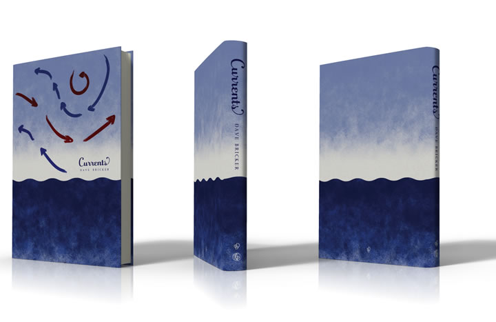 The best way to package a book will vary greatly depending on how it’s printed, how its published and how it’s distributed, but it makes sense to begin the process with a healthy disregard for conventional thinking about the relationship between a book’s design and its marketability. Perhaps the ideal approach, at least for indy publishers who may never see a bookstore shelf, is to simply honor the writing with design and craftsmanship of highest quality?




You must be logged in to post a comment.