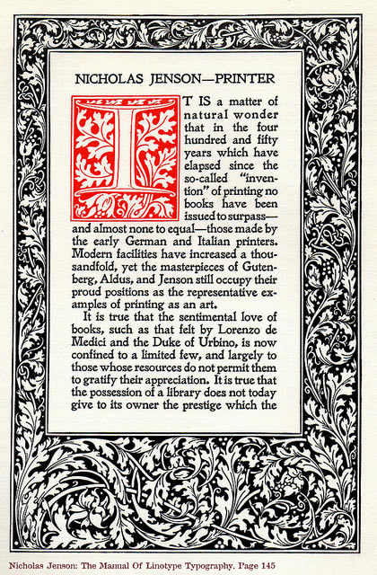
 ven high-end books of today rarely compare to the quality of bookmakers’ standard offerings from the days of hot metal type.
I work creatively to push the limitations of digital production technology and leverage its advantages to produce a classic, elegant result.
Trade publishers must invest in printing thousands of copies of a book before there is any indication it will succeed. They employ smaller, more tightly-packed text and narrower margins to offset expense and risk at the cost of good design and comfortable reading.
Your book’s typography will be carefully researched, and an appropriate mix of classic and contemporary typefaces selected. Every line, paragraph, and page will be manually inspected to ensure the highest standards of readability and design.
Margins are based on classic bookmaking alchemy rather than on any need to conserve space for printing economy. The leading (line spacing) in my book designs is generous; reading is easy on the eyes.
Readers must be the final arbiters of quality for both the story and the design, but after the tiny details have been looked after, you’ll be proud to share your elegant and comfortable-to-read book.

You must be logged in to post a comment.