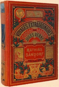
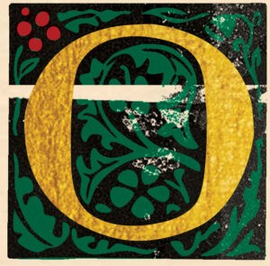
 pen almost any vintage volume. It’s elegant and easy to read. The binding is leather or cloth, perhaps with gold foil or embossing. There’s something solid, lyrical, and traditional about it that reminds us instantly of why we love books and reading.
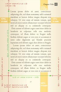
Now grab today’s bestseller from a bookstore. The mass-produced contemporary book is built with tiny type, narrow margins, lightweight paper, and a cardstock cover. It’s fabricated to mitigate the risks publishers take when they ship boxcars of books to retail stores and pray those books aren’t returned unsold.
Sadly, the old printing and book design skills have faded away. Today’s digital designers use new tools and follow new trends. Nobody seems to remember a time when a novel didn’t look like a phone book. (A lot of people don’t even remember phone books!)
What about your book?
 hat if you could place your manuscript in the hands of a trained graphic design scholar who has spent decades figuring out how to use digital tools to replicate the look and feel of hot metal typography and classic book design aesthetics?
What if you could craft a book on your own that a major publisher could never produce for you?
And what if you had access to high-level design and publishing guidance so you could protect your rights and royalties and safely and successfully make the journey from manuscript to bookshelf?
Would you and your book stand out?
hether you’re publishing a book for commercial release or wish to create a volume for private distribution or fundraising purposes, you’ll find a vast library of sound advice here about writing, publishing, book layout, and cover design.
You’ll also discover hard-to-find boutique book typography, cover creation, publishing guidance, and editorial services capable of transforming your manuscript into an instant classic.
Welcome to the World’s Greatest Book!
You must be logged in to post a comment.