Bad Kerning Awards: Typography and Your Brand
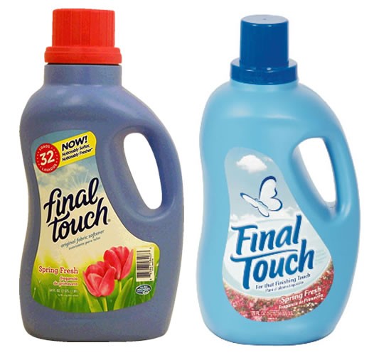
 After a redesign, the folks at Final Touch should have found a solution. How much money do you think gets invested in branding a product like this? A snappy name might sound good, but type matters. Sometimes the visual message might not convey the intended meaning. Though it’s easy to chuckle over this kerning (letter spacing) faux pas, the consequences of the unintended association caused by the juxtaposition of two simple letters could cost this manufacturer a fortune—even though it might be a superior product. The pink roses don’t help the effect.
What’s impossible to measure is how many consumers who see this product on a store shelf register the unintended meaning subconsciously—like the brilliant arrow in the FedEx logo. So many people have never noticed it, but how many of them have been touched by it nonetheless?
![]()
Kerning: Touched by What?
Final Touch is a branding nightmare. Unless they change their name and relaunch, they’ll need a skilled typographer to design a logo that’s visually stronger than the magnetic attraction between the F and the I.
The problem becomes obvious when the printer puts a bit too much ink on the press. Though I’m uncertain where this image came from and it’s possible the problem was digitally exaggerated, the kerning problem is quite real.
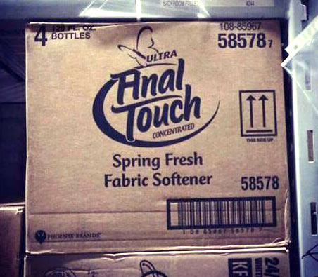
Kerning: Fun Family What?
Another example is this sign I photographed in a shop window a few weeks ago:
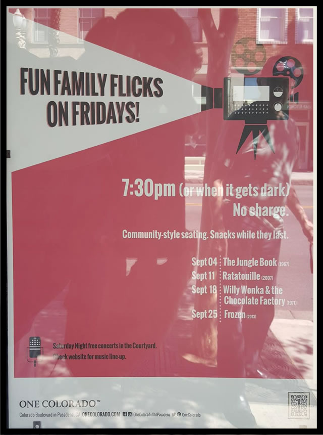 It’s easy enough to read when you’re standing in front of it, but anyone driving by 15 feet away might see a different message. The tight kerning is a liability, and in side-of-the-road signage, where viewers approach from the side, get a straight-on view for a moment, and then continue past, wider characters are legible for a longer time. In fact, typefaces have been designed especially for creating legible signage.
In particular, watch out for words that begin with letter combinations like F-I and F-L-I. If you do use them, kern them carefully and design them in ways that keep them from morphing into As or FUs.
Whether you’re a writer or a designer, pay attention to type. Typeface choice, layout, kerning, leading (line spacing) and other factors make a dramatic difference in how your message is perceived. Writers—even commercial copywriters and slogan writers—create a product that’s ultimately visual. Designers must dig deeper than “looks good” to accurately convey the spirit and intention of the writer.

You must be logged in to post a comment.